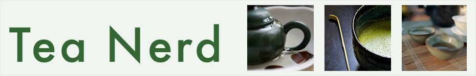
Well, let's just say I got tired of the old look. I think this design is much nicer looking, and the colors are a lot less, well, dirty-looking. If your browser is having any troubles at all, please email me at [email protected] with your browser and OS info (for example: Firefox, Windows XP) and what the problem is. Thanks!
Also, I expect to be pretty busy this week, so unfortunately you should expect some more inactivity here for the next week, give or take a couple days.
Anyway, I hope the new layout makes up for any infrequency in my posting. Enjoy!
Sunday, February 11, 2007
Subscribe to:
Post Comments (Atom)


Hey Tea, Nice look. I just love your post!!! I wish I could get my blog looking like yours! ;)
ReplyDeleteCiao
Bill, AKA Hop_goblin
I'm a bit conflicted about the new color scheme. I like the theory behind the update. After all, a clean look is a good look, and the white background does make your links column easier to read. But I find that all the white also makes your very lovely headers look washed out and the rest of the link text a bit cramped.
ReplyDeleteI used both Firefox and Safari on Mac OSX to view your site.
Mary-- I didn't realize it until you made your comment, but you were right. So, I've intensified some of the colors in the hope that things would not look as washed out as before, and the font size of the sidebar has been made smaller to hopefully reduce the cramped look. Hope it's better now!
ReplyDeleteHoly quick response to feedback, Batman!
ReplyDeleteI can't believe the difference a color tweak and and a font change makes.
Site looks good, man. Very good indeed.
The green header with the photo of roasted green tea is very attractive and makes me want to brew something. Nice design. (Although I think Hop_goblin's is also very lovely, despite his self deprecating remark above.)
ReplyDelete