Today I enjoyed some lovely
Taiwanese "Wuyi" baozhong. My notes for this tea are already posted, so I won't bother repeating myself; instead, I wanted to talk a bit about stationery.
 Pouring out the preheat rinse.
I've posted pictures of pens and paper before, but I haven't really written (typed?) much about either. Writing with a good pen on thick, smooth paper is really quite fun, and is the most enjoyable way I've found to take notes while tasting. It was
Hobbes who originally gave me the idea to use pen and paper instead of a computer while drinking tea. I bought a Moleskine notebook, and started logging my notes with a regular ol' ballpoint. It was a nice change of pace from typing, which was the norm during my college career.

After a long chain of unrelated events, I eventually picked up my first fountain pen. It was a pretty big change; most fountain pens don't lay down the razor-fine line that ballpoints do, and they require a bit of a learning curve. One thing I learned:
Moleskines feather like mad, and most fountain pen users dislike them for their low-quality paper. As soon as my lovely new Waterman Hemisphere hit that paper, the ink spread out and left a muddled, ugly, thick line. Great. Some of this was related to the pen I was using; different pens, papers, and inks have unique interactions with each other. Still, I was committed to my new pen, so I abandoned the once-beloved Moleskine and looked for better options.

My current favorite pad is made by a French company named Rhodia. Rhodia pads come in a myriad of shapes, sizes, and rulings, but most importantly, the paper is to die for. It is lusciously smooth— fountain pens
glide on this stuff— and does not feather at all. Mmmm. Some other brands I like are Apica and Black and Red, but they don't make staple-bound, reporter-style notebooks with perforated pages (gosh I'm picky, aren't I?) like Rhodia does.


 My Lamy 2000; note the "hooded" (and messy) nib. Click on the bottom-right photo for a close-up of the makrolon texture.
But paper is only one part of the equation— what about the pen? I have a bunch of relatively cheap pens, but my two favorite pens are my Lamy 2000 (shown above) and my Lamy Vista (the clear one, two pictures up). The Vista is just a good pen, not a great one (though very good for the price), but it has an italic nib, which is a lot of fun. The 2000 is my "best" pen by far, though; it has a smooth, fine, semi-flex nib. Both italic and flexible nibs introduce attractive line variation in one's pen strokes (you can tell how they differ by the text shown with the two pens), which makes chicken scratches like mine look a little better and makes good penmanship look spectacular.
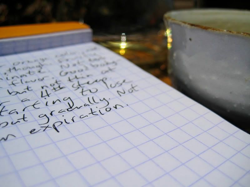 Close-up of my "improved" handwriting.
Lastly, there's ink. I have just begun to explore the immense variety of inks out there, so I don't have much to say. The two inks shown in the pictures here are Noodler brand; Ottoman Azure, the blue ink in my Vista, and Heart of Darkness, the deep black ink in my 2000. A great resource for checking out inks (not to mention pens, paper, etc.) is
the Fountain Pen Network— there are tons of ink scans and reviews posted there.
Sorry for the long post! I suppose I should have split this up into a few posts, but as they say, strike while the iron's hot! Thanks for reading, this blog will return to its regular (tea) programming shortly.